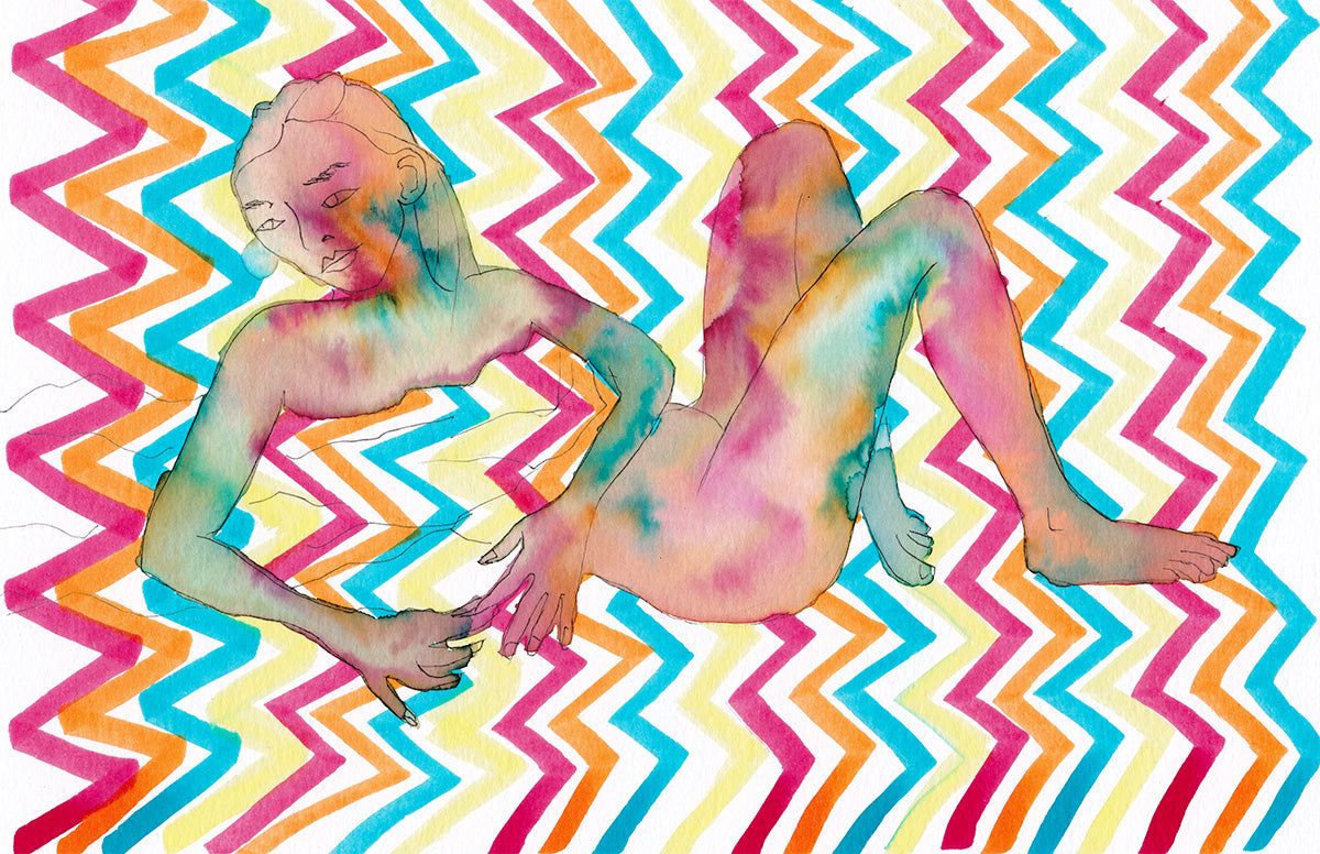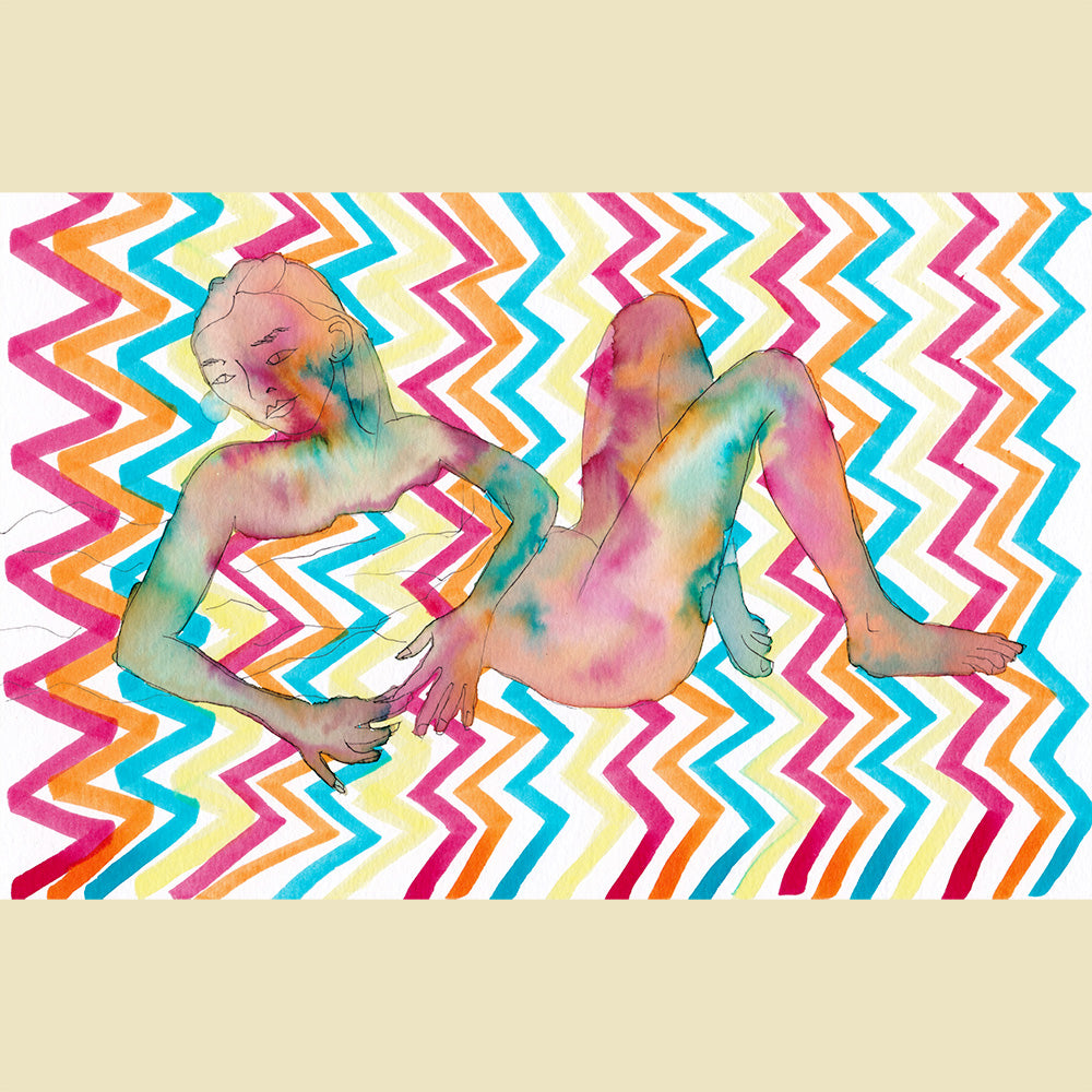
This is a study I made (one of many), exploring the female figure blending with a freehand pattern.
I don't like the splurge around the fingers and I was tempted to tidy it up in Photoshop. But then I weighed up the time it would take and decided it's probably best to move on and keep the creations flowing, rather than dwelling on the details in one image.
Going forward, I might digitally scan the pattern before I apply the water (which creates the body surface). That way, I have an option to edit a digital version in Photoshop. I can have two layers: a before version and an after version as a base layer. This will make it easy to erase splurges in the foreground and reveal the clean background pattern behind.
It's easy to get water drop accidents as well, and I'm tempted to clean these up. Sometimes mistakes add energy to the piece. But in this case, the splash near her right eye is just confusing. Conversely, if the edge of the figure is too neat, it deadens the spirit of the picture.
Control and precision versus spontaneity and flow are a big consideration.
